Mercury Insurance Customer Portal
Empower policy holders to take charge of their policies
Summary:
Mercury Insurance customer portal designed to give policy holders instant access to I.D. cards, view policy details, and pay bills. One touch access to your agent, customer service and roadside assistance. Allowed users to get real time quotes, make policy updates, add vehicles and add drivers.
Major Tasks & Responsibilities:
My role was to research, design, and test all user experience and user interface related to the project.
Platforms:
Mobile, Tablet, and Desktop
Design Tools / UX Methods Used:
Axure, Adobe XD, Sketch, Competitive Analysis, Stakeholder Interviews, Card Sorting, User Personas, User Testing
Team Members & Collaborators:
UX Design Engineer: Robert Olide; Stakeholders: Director of Customer Service and Director of Branding, Project Manager, Business Analyst, and Developer Manager
More about the project:
To begin the project, I interviewed stakeholders and users. Competitive analysis was structured around the information provided by seasoned insurance account holders to understand the current industry trends. Working with the Manager of Consumer Affairs, we compiled a list of features we wanted to further explore.
Link to Project
https://apps.apple.com/us/app/mercury-insurance/id1538025662
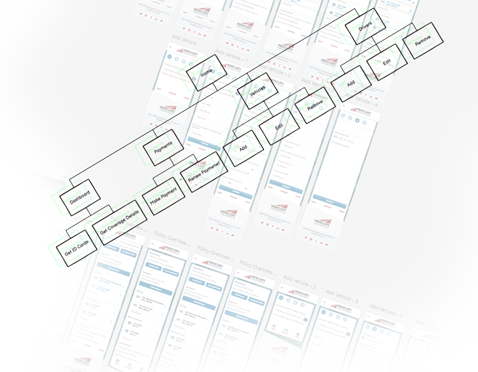
Flow investigations
I created a sitemap using simple card sorting techniques and white board sessions to iterate through flow options efficiently. Working with insurance specialists and the engineering team, we locked down a sitemap and had a rough idea to begin low fidelity wireframes.
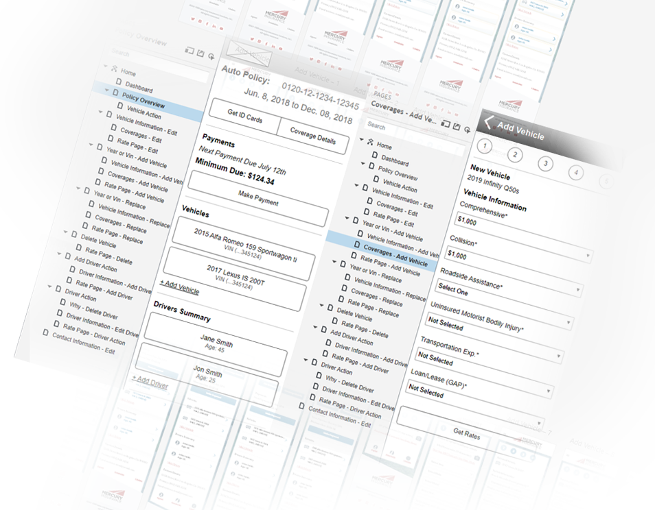
Flow Research
I created low-fidelity wireframes using Adobe XD and Axure to further shape the experience and start touching some of the key design elements. Working with stakeholders, engineers and subject experts, using live sessions, before moving on to the testing stage.
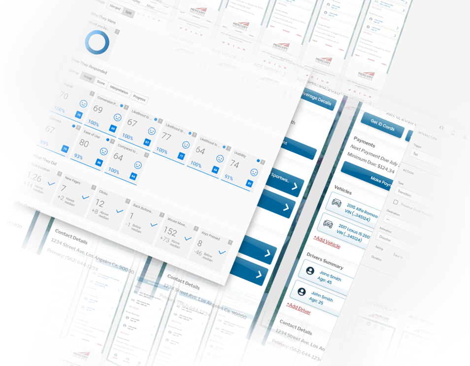
Prototypes
Once the initial wireframe was tested, I created a prototype using Axure, so that we could test and confirm our flows. Working with Soundingbox and User Testing, we were able to obtain recorded feedback from users and internal team members. This allowed us to further modify and update to ensure the portal was easy to use, but also delivered the business partners a tool they can leverage.
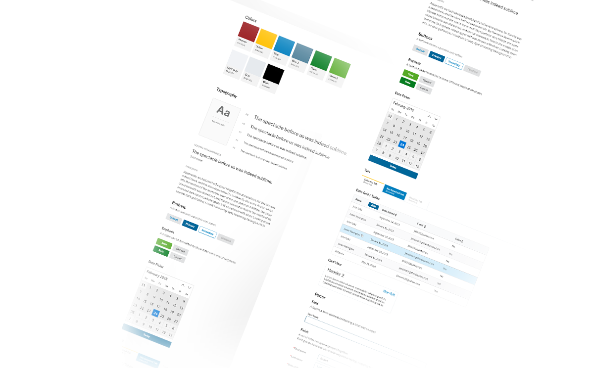
Design
I created a design system that was tailored for Mercury’s teams and processes. Working closely with the engineers and the Q.A. team we used the design system to ensure the project stayed on course and was delivered.
Learnings
I learned an extensive amount about the insurance industry on the business side and the consumer side. Utilizing SoundingBox.com was a refreshing experience; to have a tool that delivered almost instantaneous feedback from users helped us improve the experience of the application.
The project had many challenges, but the most difficult was working with a new team that had never collaborated with a UX Designer. Thankfully, we were able to get everyone on board and received good feedback. The team is now very much engaged and have readjusted their budgets to include UX as part of their project cycle for all future projects.
